This is the fifth installment of my Throwback Thursday. This week is all about logo design and I decided to showcase the first one that I ever created at Villa Maria College.
This design was created my Freshmen year in the Fall 2011. This was the first logo design that I created at Villa, the idea behind the design was simple. We had to pick one letter and one number and combine them in a serious of designs, from there your favorite design would be created into your logo. I combined a lowercase "r" and the number 2. Since my name is Rachel Rising and I've been called "R" squared on occasions it made sense. After about fifty sketches and four designs I final picked the one below.
If I had to make any chances to the design I would make a color chance, and probably create a new company to represent the logo. Since this is one of my first designs, I'm proud of how it turned out and wouldn't change it for the world.
Creating something out of thin air is easy. It's finding the air that's hard. - Asher Trorrer
Showing posts with label logos. Show all posts
Dec 11, 2014
Nov 23, 2014
{ Creepy Logo Designs }
Once again Buzzfeed has created another graphic design video, this one highlighting creepy logo designs. This video is a grouping of some of the weirdest logo designs ever created. The moral of this video is to always have someone else check out your logo design before you submit it to your client. They may catch on to something that you didn't, they may even help to make sure you don't end up on Creepy Logo Designs 2.
Nov 6, 2014
{ Saul Bass }
Saul Bass is one of the most well known designers and personally one of my all time favorite designers. As a young designer he is such an inspiration, his use of simplicity is something that I truley admire. Saul was an American designer and Academy Award winning filmmaker, best know for his design of motion picture title sequences, film posters and corporate logos. It can be hard to believe all the things he created. Here are just a few of his amazing creations.
Girl Scouts of America
North By Northwest title sequences
Bell South
AT&T
The Quaker Man
United Airlines
Vertigo movie poster
United Way
Kleenex
The Shining movie poster
Exxon
Frontier Airline
Anatomy of a Murder movie poster
And many many more, Saul Bass is an amazing artist and is such a great inspiration to designer everywhere, especially to a youth designer like myself.
Oct 29, 2014
{ Brand Logos That Have Gone Flat }
In the last year there has been numerous logo changes on some of the worlds must popular logos. It seems that drop shadows, texture ans bevelled edges are out and solid colors are in. The latest trend in graphic and web design is to undo all those fancy Photoshop effects that have been popular for several years. Here are some of the logos that have changed to a much more flat approach.
{1} Salesforce-
Salesforce puts business intelligence in the cloud, and its logo used to be a softly rendered cloud with the company name emphasizing "force" by the strong color of text. The new version relies on the shape of the graphic to relay the cloud idea, using a uniform sans-serif font, except for the italic "f" that effectively highlights the word "force"
{2} MSN
MSN used to reference the four color pane of Window through the wings of an abstracted butterfly. The butter fly has been retained as a symbol of connectivity, but those colorful, overlapping, translucent wings have been clipped in favor of a flat, classy look that fits in with the greater Microsoft re branding project.
{3} About.com
About.com used to depend on a 3D sphere that served as the "O" in "About", Now the 3D look is gone, the ball has grown and the color of the logo has been unified. The new version is certainly cleaner and quite reminiscent of the AMC Theatres logo
{4} Fandango
Fandango implements the suggestion of a ticket stub that also doubles as an "F" for its graphic. The shadowed older version gives way to subtler, flatter representation with its logo redesign. The new version is a welcome refresh. By comparison the old logo seems ugly with far too many outlines and shadows on the "F' and terrible kerning on the word "Fandango"
{5} Peter Piper Pizza
Peter Piper Pizza recently unveiled a possible new future for its brand. They've abandoned the pizza, paper fan banner in favor if a more abstract mark that incorporates both a slice of pizza and a salad bowl. According to WD, the agency behind the new branding. the update is an attempt to connect with Millennial parents. Unfortunately, in doing so they likely lose much of the "fun" factor that will appeal to their real target audience, kids. Thus far many outsider review of the new logo have been negative. The typewriter font especially an area of contention. The current Peter Piper website has maintained the old branding
{6} Olive Garden
Olive Garden was definitely a brand with an old world aesthetic. It simply doesn't get much more textured and gaudy than their previous logo. The new version is greatly simplified. Though it has been the target of countless design bashing sessions, its certainly more in line with current design trends. The use of the olive shape in the typography , and the wording "Italian Kitchen" seems fresher than "Italian Restaurant"
{7} Netflix
Netflix had dropped the shadowed lettering from its name, but retained the curve of the lower text line, reminiscent of old theater marquess. It's one of the most subtle, yet trans formative, re-work of any recent change in design, demonstrating how much can be done with minimal changes/
{8} Hershey's
Hershey's is one of the best known brands around, so a logo redesign is a big deal. The updates drops the apostrophe "s" and replaces the photo of a Hershey's kiss with a simplified illustration. The tag line has been updated as well, dropping serifs in favor of a more modern look. It's simple enough rework that likely moves in the right direction, but it instantly got a bad rep on social media due to some childish Photoshop tweaks.
{1} Salesforce-
Salesforce puts business intelligence in the cloud, and its logo used to be a softly rendered cloud with the company name emphasizing "force" by the strong color of text. The new version relies on the shape of the graphic to relay the cloud idea, using a uniform sans-serif font, except for the italic "f" that effectively highlights the word "force"
{2} MSN
MSN used to reference the four color pane of Window through the wings of an abstracted butterfly. The butter fly has been retained as a symbol of connectivity, but those colorful, overlapping, translucent wings have been clipped in favor of a flat, classy look that fits in with the greater Microsoft re branding project.
{3} About.com
About.com used to depend on a 3D sphere that served as the "O" in "About", Now the 3D look is gone, the ball has grown and the color of the logo has been unified. The new version is certainly cleaner and quite reminiscent of the AMC Theatres logo
{4} Fandango
Fandango implements the suggestion of a ticket stub that also doubles as an "F" for its graphic. The shadowed older version gives way to subtler, flatter representation with its logo redesign. The new version is a welcome refresh. By comparison the old logo seems ugly with far too many outlines and shadows on the "F' and terrible kerning on the word "Fandango"
{5} Peter Piper Pizza
Peter Piper Pizza recently unveiled a possible new future for its brand. They've abandoned the pizza, paper fan banner in favor if a more abstract mark that incorporates both a slice of pizza and a salad bowl. According to WD, the agency behind the new branding. the update is an attempt to connect with Millennial parents. Unfortunately, in doing so they likely lose much of the "fun" factor that will appeal to their real target audience, kids. Thus far many outsider review of the new logo have been negative. The typewriter font especially an area of contention. The current Peter Piper website has maintained the old branding
{6} Olive Garden
Olive Garden was definitely a brand with an old world aesthetic. It simply doesn't get much more textured and gaudy than their previous logo. The new version is greatly simplified. Though it has been the target of countless design bashing sessions, its certainly more in line with current design trends. The use of the olive shape in the typography , and the wording "Italian Kitchen" seems fresher than "Italian Restaurant"
{7} Netflix
Netflix had dropped the shadowed lettering from its name, but retained the curve of the lower text line, reminiscent of old theater marquess. It's one of the most subtle, yet trans formative, re-work of any recent change in design, demonstrating how much can be done with minimal changes/
{8} Hershey's
Hershey's is one of the best known brands around, so a logo redesign is a big deal. The updates drops the apostrophe "s" and replaces the photo of a Hershey's kiss with a simplified illustration. The tag line has been updated as well, dropping serifs in favor of a more modern look. It's simple enough rework that likely moves in the right direction, but it instantly got a bad rep on social media due to some childish Photoshop tweaks.
Sep 27, 2014
{ If Logo Told the Truth }
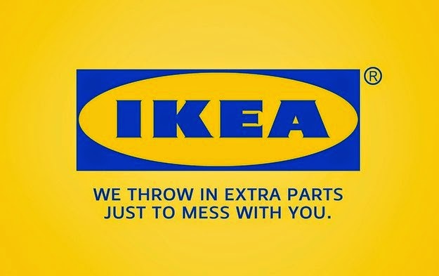
It may not come as any surprise from some of my posts but I'm a fan of the social media website Buzzfeed. In the last couple of months they have been posting numerous things that relate to graphic design and advertising, two of my passions. One of the funniest and most relatable things they have posted was something that calls out companies and there logos. It may not come as a surprise but many logo have been know to stretch the truth or even make consumers question the product. A designer took it in his own hands to show what logos should say, some of the redesigned logo are humerus, where others really get you thinking. Below I have posted some of the best of the truthful logos.
Buzzfeed even decided to join in on the fun by creating one about themselves.
Labels:
Buzzfeed,
graphic design,
IKEA,
Jif,
Kraft,
Linkedin,
logos,
Netflix,
Pepsi,
Red Lobster,
Tostitos
Subscribe to:
Posts (Atom)